Time Period: 20th Century, Civil Rights Movement, Depression
Topic: Culture, Foundations
The History of the Chicago Blackhawks Logo
The Chicago Blackhawks are an NHL team that has been around in the league since 1926. The team was created by Frederic McLaughlin and was named after the 333rd Machine Gun Battalion of the 85th Division of the U.S. Army during World War I. There was also a Sauk Indian Chief that was the prominent Indian Chief during the early 1800s that was being represented and honored along with the division he was in.
The team faced forms of racism and discrimination with their involvement in professional sports. The Civil Rights Movement of the 1960s was a huge part of them actively because of the treatment of the players, despite the thought of them not being discriminated. This created a disrespectful conduit that was being adamant about refusing to further the behavior that the players were facing, the reasons as to why the Mascots/Logos are not meant to be offensive because the team was fighting in the 1960s for the Civil Rights Movement.
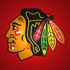
The Logo itself went through many iterations throughout the team’s history that started with a logo by Irene Castle, McLaughlin’s wife. She made the original design for the team that was a basic black and white design that had the side profile of an Aboriginal American. Presumed to be Black Hawk, was inside a roundel that featured the team’s name. There is a nostalgic feel that this logo gives making it difficult to understand as to why they faced discrimination because of it.
In the 1930s, however, the Blackhawks would add color to their jerseys and logos. This colorized logo added a red color that was Black Hawk’s head along with a tan color that was added to the roundel. They changed the backdrop from black to white, also the hair was made black with the feathers being a single color.
From the 1940s – 1960s, they wanted to get rid of the roundel completely so that it would just be Black Hawk’s head on the jersey. This was made into 2 different iterations being called “Old Man” and “Fat Man.” They would also add a Tomahawk Cross to the jersey as well in the 40s and made it even better in the 50s. The “Fat Man” was the prominent logo for the team between the 60s, when the Civil Rights Movement was going on, all the way to the 90s. That would be the only logo that would stay like that until the current logo they use today. The Blackhawks would win the Stanley Cup in 1961 which is why the team wanted to stick with the logo for as long as they did.
With all that in mind, the team faced discrimination because of the use of an Indian name and mascot that was being considered “racial stereotyping.” That was causing low self-esteem with the American Indians. Indian children were targets with the harassment of others. However, the Blackhawks are not facing the number of issues that the Redskins are facing to this day. They are a team that was named after because of the pure respect that the founder had for his previous battalion and the former chief who was said to be “represented” through the logo.
Citations
- “A Public Accommodations Challenge to the Use of Indian Team Names and Mascots in Professional Sports.” Harvard Law Review 112, no. 4 (1999): 904-21. doi:10.2307/1342299.
- Ferrell, Peter. “Chicago Blackhawks Logo History.” The Hockey Writers. April 08, 2019. https://thehockeywriters.com/chicago-blackhawks-logo-history/.
- Inskeep, Steve. “How Is the Blackhawks’ Name Any Less Offensive Than the Redskins’?” The Atlantic. June 22, 2016. https://www.theatlantic.com/entertainment/archive/2015/06/blackhawks-redskins-name/396356/.
- Martens, Tim. “Chicago Blackhawks’ Logo Change Would Be Sign of Respect.” Blackhawk Up. January 30, 2018. https://blackhawkup.com/2018/01/30/chicago-blackhawks-logo-change-would-be-a-greater-sign-of-respect-than-current-logo/.
- Nicholson, Stacie L. “Indian Mascot World Series Tied 1-1: Who Will Prevail as Champion?” American Indian Law Review 29, no. 2 (2004): 341-62. http://www.jstor.org/stable/20070736.


